Earlier today HN reviewed a proposed github redesign and largely didn’t favor it.
I figured I’d take a stab at it
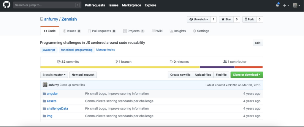
Before:
After:
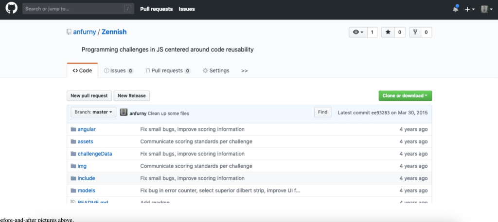
See the proposed before-and-after pictures above.
Here are some principles that seem intuitive to me, and maybe designers might consider them too.
- The visibility of an item should be proportional to its usefulness. This includes size, placement, brightness/colorfulness.
- There is always a flexible solution which caters to both experts and novices simultaneously.
- Hierarchy of UI should reflect conceptual hierarchy.
In practice here are the things I changed in my mockup, based on those 3 rules:
- Create new file has no business being on the same line as “Clone repo.” It is a branch-specific operation next to a repo-specific operation.
- The current-branch dropdown/button should connected-to the file-list widget. The file-list widget is showing files of that branch. The two are logically interdependent but visually separated.
- Wiki and Insights are features I have never used on github and may never use. They should be hidden by default. They can intelligently show for repos that have ever once used those features.
- The repo description shouldn’t be in the code tab. The repo description is an attribute to the repo itself
Good luck on your design journeys.